style guide
This page is a compilation of guidelines and tips for maintaining a consistent artstyle in GDG’s team projects. This style guide is currently focused on our WIP pixel art game, but will be updated as more projects are made!
tips for pixel art
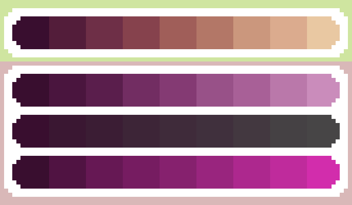
- Use a limited color palette. Too many colors in one sprite can make it look muddy, uncannily smooth, and inconsistent. There is no set limit for a palette size, but generally more than 16 colors for a single sprite is too many. You can use Aseprite’s palette feature to track your colors and
Shift + R to replace all instances of a color in a sprite.
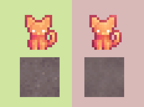
- Lighter colors should have a hue closer to red, lower saturation, and higher value/brightness. The inverse is true for darker colors (their hue should be closer to violet). This method of generating a palette isn’t always what a sprite needs, but generally leads to warmer and more natural colors.
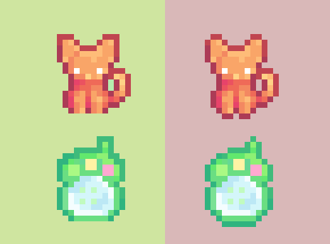
- Use outlines to shape silhouettes. Although the outline of a sprite should generally cover the entire sprite (except the bottom), adding or omitting some pixels is useful for suggesting pointy-ness or roundness.
world
characters